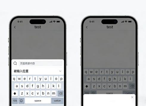





In WeChat, when an H5 input is focused, why does the button below sit on top of the keyboard—is it a code bug or just how the container works?
When an H5 input is focused and the button below overlaps the keyboard, it is usually not a code bug, but the keyboard changing the visual viewport height, combined with the browser's auto-scrolling and fixed-position rules. In 2026, when building H5 inside WeChat, do not rush to disable page zoom or add a JS patch: first separate 'what is changing, what is being pushed, and what is calculating,' then decide which layer to change. If you cannot distinguish these three layers, you will easily keep adjusting values in the wrong place.
When the keyboard comes up, which layer changes?
Many developers see the page jump around after an input is focused and immediately add a meta tag to disable zoom. But in iOS Safari, the page getting enlarged is usually because the input font size is smaller than 16px, and the browser auto-zooms so you can read the content—this is a different issue from the keyboard pushing the page up. What the keyboard changes is the visualViewport. It generally does not affect the layout viewport, so heights calculated with vh or 100% do not change along with it.
The real problem is the combination of three layers: the visual viewport shrinking, the browser auto-scrolling to keep the input visible, and the page's own scrollTop correction. These three often move in different directions, which shows up as the input jumping, the bottom-fixed button drifting, and a blank strip at the bottom after the keyboard is dismissed.
- Layout viewport: stays unchanged in most mobile browsers and is used for layout calculation; vh refers to it.
- Visual viewport: its height shrinks after the keyboard opens; you can read the real value with the Visual Viewport API.
- Scroll position: the browser automatically scrolls the focused element into the visible area; if the page also changes scrollTop, the two will conflict.
- Fixed-position elements: bottom-fixed buttons and bottom tab bars are pushed up in some containers, while in others they float above the keyboard.
- Height units: 100vh on mobile often does not equal the current visible height; dvh/svh support is now fairly good, but older WebViews still have gaps and need a percentage fallback.
Why iOS, Android, and WeChat each behave differently
The same code behaving inconsistently in iOS Safari, Android Chrome, and WeChat's built-in browser is normal. In iOS Safari, the keyboard opening generally does not change the layout viewport, and fixed elements are commonly pushed above the keyboard. In Android WebView, if the host sets adjustResize, the layout viewport shrinks; if it sets adjustPan, the whole page pans upward and bottom-fixed buttons move with it. The same 'pushed into disorder' has different root causes in different containers.
WeChat's built-in browser uses different engines on iOS and Android, and mini-program web-view is yet another separate container. Before delivery, first confirm which containers and device tiers this release covers, rather than looking for a one-size-fits-all code snippet. From experience, covering these four categories—iOS Safari, WeChat iOS, WeChat Android, and mainstream Android browsers—can prevent most rework.
Troubleshooting order: the three visual viewport questions
I call this order the three visual viewport questions: what is changing, what is being pushed, and what is calculating. These three types of causes require completely different fixes—viewport issues need different height values, occlusion issues need layout layering changes, and calculation issues need redundant JS removed. First classify the problem into one of these categories, then act; the chance of rework drops noticeably.
- What is changing: print visualViewport.height, window.innerHeight, and the scroll container height before and after focus to confirm which layer actually changed.
- What is being pushed: list all fixed/sticky bottom elements on the page, and for each one check whether it is covered, pushed, or positioned normally when focused.
- What is calculating: search for 100vh, 100%, and any variable that caches a height at initialization; such values do not update automatically after the keyboard is dismissed.
- Turn off JS fallbacks first: temporarily comment out scrollTop corrections, scrollIntoView, and similar logic to see whether native scrolling is already sufficient; if scrollIntoView is called before the keyboard animation ends, the position is usually off.
- Then add the smallest patch: only listen to visualViewport when native behavior is insufficient, and handle blur restoration at the same time; missing restoration logic is a common cause of bottom whitespace.
How to choose among three approaches, with experience ranges
No approach is inherently better; the key is the delivery containers and page shape. Below I list them by change effort, suitable cases, and unsuitable cases. Timelines are given as experience ranges, and actual variation depends on how many device models need regression testing.
- Approach A: pure CSS adaptation (dvh/svh plus a vertical flex layout, with the bottom bar using sticky). Change effort is typically within half a day; suitable for form-centric pages with controllable delivery containers; when older Android WebViews do not support the new units, use a percentage fallback—do not write only one set.
- Approach B: listen to visualViewport and set the container height dynamically. Change effort including compatibility regression is typically 1–3 days; suitable when multiple containers must be covered and bottom-fixed actions need precise avoidance; if it is added only on individual pages while global layout has another system, they can interfere with each other.
- Approach C: let the client handle it (a proprietary App shell sets the soft keyboard adjust mode or keyboard avoidance). Configuration changes are typically within half a day; it only works in projects where the shell can be modified, and WeChat and third-party browsers do not have this switch, so it cannot be a universal solution.
A simple rule of thumb: if the page has only one input and no bottom-fixed action, prefer Approach A; for multi-container delivery where a bottom-fixed button must stay present, use A plus B; for H5 embedded in a proprietary App, first ask whether the client can solve it at the shell layer, then decide whether the front end needs to act.
Delivery in the field: pitfalls from a three-day launch
Based on project delivery experience, problems often come from tight timelines and many containers overlapping. A common situation: an order page must go live within three days and cover iOS Safari, WeChat iOS, WeChat Android, and Android browsers; to align quickly, the team first writes logic that listens to resize and automatically sets the container height. As a result, on iOS the resize timing after the keyboard is dismissed is unstable, leaving a blank strip at the bottom of the page, while on Android the scroll position is taken over. In the end they fall back to CSS-first with JS only for blur restoration, spending about two extra days overall (experience range). When constraints are not clarified in advance, the cost usually shows up in regression testing.
- Caching window.innerHeight only once, so the old value is still used after the keyboard is dismissed.
- Adding overflow:hidden to body on focus, causing the scroll position to be lost after the keyboard is dismissed.
- The input font size is smaller than 16px, so iOS auto-zooms and it looks like the page has been pushed away.
- The bottom-fixed button is placed in a fixed layer that overlaps the keyboard area, so taps are swallowed.
- Debugging only in a simulator or desktop browser; problems appear only on real devices.
Acceptance criteria can be reduced to five points: after focus, the input is fully visible and not covered by the keyboard or bottom bar; after blur, page height and scroll position are restored with no extra blank space; the page does not scroll horizontally or zoom as a whole; at least one real device each for iOS, WeChat, and Android passes; and the bottom-fixed button's behavior when the keyboard opens matches the design expectation—hide, move up, or move down, choose one—and is written into the acceptance checklist.
Applicable and non-applicable boundaries
The cases suitable for this are fairly clear: input-heavy pages such as checkout, login/registration, comments, and search suggestions; H5 embedded in proprietary Apps; and projects whose delivery requirements explicitly cover multiple browser containers. In these scenarios, keyboard avoidance directly affects whether users can complete the action, so it is worth scheduling some dedicated time. Work involving multi-device regression is usually scheduled separately based on the number of containers, not squeezed onto the same timeline as main feature development.
The boundaries are also clear: purely display-oriented long pages, and admin pages with only a single search box and no bottom-fixed action, usually do not need visual viewport listeners for this. If the input itself remains in the visible area when the keyboard opens and there is no bottom-fixed action, then adding visual viewport listeners most likely only increases maintenance cost. For such pages, raising the input font size to around 16px and relying on native scrolling is generally enough.
Frequently asked questions
Does disabling page zoom fix the keyboard pushing the page up?
Generally no. Disabling zoom only affects auto-zoom on focus, while the keyboard changes the visual viewport height. They are not the same problem and need to be handled separately.
On a page using 100vh, why is the bottom button covered after the keyboard opens?
Because 100vh refers to the layout viewport, which often does not change when the keyboard opens. The page still lays out at full-screen height, so the bottom area naturally falls within the keyboard's range.
It works in WeChat but is misaligned in iOS Safari—which side should be fixed first?
Fix the stricter container first, usually iOS Safari, then go back and regress in WeChat. Avoid changing both at the same time, which makes it hard to tell where the problem comes from.
What usually causes bottom whitespace after the keyboard is dismissed?
It is commonly because JS dynamically set the container height or scroll position but did not restore it on blur; it may also be unstable resize listener timing on iOS.
If the page is an input-heavy scenario and must be delivered across multiple containers, it is advisable to proceed in the order of first getting the height right, then applying the smallest JS patch, and to leave at least half a day for real-device regression (experience range). Conversely, for purely display pages or pages without bottom-fixed actions, first confirm whether the input itself is visible when the keyboard opens; if it is visible, there is no need to add extra patches. Verify your judgment against official documentation and each container's specifications—do not ship based only on a copied code snippet.
-
How Much Accessibility Is Enough When Development Is Halfway in 2026?
Date: Sep 2, 2026 Read: 124
-
It's 2026 and My Uni-app App Is Rejected for a Privacy Popup Not Shown First — I Did Show It, So Are the SDKs Running First?
Date: Oct 15, 2026 Read: 2
-
An H5 campaign page embedded in Flutter scrolls rough on Android—which layer should you touch first?
Date: Oct 14, 2026 Read: 6
-
It's 2026 and the page title isn't in the source code — where does Baidu get the indexed title?
Date: Oct 13, 2026 Read: 10
-
OnPush child component not refreshing with polling data in Angular: replace the array reference first, or add markForCheck first?
Date: Oct 12, 2026 Read: 15