




PC Looks Fine but Mobile Is Broken: What's Most Likely Wrong in 2026?
When a page looks fine on PC but breaks on mobile, it's usually not a single property written incorrectly — it's a combination of four types of issues: viewport, width basis, positioning context, and touch targets. Based on 2026 project delivery practices, when you encounter "fine on PC, messy on mobile," don't rush to adjust CSS. Follow the order of viewport → width → positioning → touch, and you can save most of the debugging and rework. The troubleshooting methods below come from actual front-end delivery, and the applicable boundaries are also given to avoid excessive refactoring for mobile.
Check the viewport first: if the viewport is wrong, everything else is wasted effort
The biggest difference between mobile and PC is the viewport width. Many pages look normal on a computer but get horizontal scrolling or distorted proportions on a phone. The root cause is often that the viewport meta tag is missing, or it's written but the content width is fixed in pixels. A common practice in 2026 is: set the viewport width to the device width, initial scale to 1, and make the root font size correspond to the design mockup baseline. Without this step, percentages and rem values will be distorted. In addition, many teams in 2026 are experimenting with container queries, but traditional media queries are still the safer compatibility option — don't sacrifice older devices for new features.
- Verify that appears at the beginning of the head
- Set box-sizing: border-box globally to prevent padding from expanding the width
- When using width: 100% or flex layout, give child items min-width: 0 to prevent content from breaking the layout
Experience range: just adding the viewport and unifying box-sizing usually solves about 50% of horizontal overflow issues; then handling flex child items can cover 70% to 80%. I once took over a marketing H5 where the design mockup was based on 750px width. The developer only scaled it proportionally but forgot to set the viewport. After launch, button text overflowed, and it took 2 days of rework before using clamp and min-width to control it. The lesson is: first confirm the running device and system font scaling, then decide on units — otherwise, even standard styles will need to be redone. Many modern frameworks automatically insert the viewport, but when modifying traditional server-rendered pages, you often need to add it manually.
Width overflow: how do child elements break the mobile layout?
If the viewport is fine but the page still has horizontal scrolling, the common cause is child elements wider than their parent container. Based on delivery experience, the three main culprits are: long English words, fixed-width images, and the default min-width: auto on flex items. These three types can cause the layout to "explode" on narrow screens. When debugging, follow the three-check method: first check whether box-sizing is unified, then check whether flex children have min-width: 0, and finally check text-overflow and overflow-wrap. This covers most horizontal overflow cases. The order of the three checks can be adjusted, but checking box-sizing first is because it is easily affected by global resets and can be confirmed at a glance.
- Long URLs or English words: add overflow-wrap: break-word or word-break: break-word
- Images or videos: set max-width: 100%, not just width: 100%
- Flex layout: add min-width: 0 to flex items to allow content to shrink
- Tables or preformatted text: add overflow-x: auto to the container to avoid page-wide scrolling
For example, on a news list page, long PC titles wrap automatically, but on mobile, without overflow-wrap, long English words can break through the container. Adding overflow-wrap: break-word to the title solves it.
fixed positioning fails on mobile — first check ancestors for transform
Positioning issues on mobile are often not about incorrect top/left values but about a changed containing block. In CSS, fixed is normally relative to the viewport, but if any ancestor has transform, filter, will-change, etc., fixed becomes relative to that ancestor, causing the element to appear in unexpected places. A common pitfall in 2026 is modals or bottom navigation being "dragged away" by a parent container. The test is simple: in dev tools, look at the computed containing block of the element, or just see if the fixed element moves with scrolling. If fixed fails, remove the transform from the ancestor, or move the overlay element under the body.
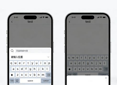
Comparison: putting the overlay under the body, fixed relative to the viewport, is the most stable logic; nested inside an animated container, you may need manual correction after every animation. Within the experience range, most modal position issues are caused by transform ancestors, and a few by parent overflow clipping. Also, in Android WebView, the software keyboard can cause fixed bottom buttons to jump — you can use visualViewport to listen for viewport height changes and adjust the position manually. position: sticky sometimes fails on mobile, usually because the parent container height is insufficient or the overflow setting is not visible, and the debugging approach is similar.
Font and touch: what standards do font size, line height, and tap targets meet?
When mobile typography and interaction feel "off," it's often not a visual issue but a lack of readability and usability. Common practice in 2026: body text should be no smaller than 14px with a line height of about 1.5; tap targets should be at least 44×44 CSS pixels, with at least 8px spacing between buttons. This is both a UX requirement and a reference dimension for search engines measuring mobile-friendliness. In the experience range, text below 12px is basically unreadable on small screens and should be avoided. In Chinese typography, text below 14px is hard to read on low-brightness screens, and 16px is safer; line height 1.5 to 1.6 is the most common range, and above 1.8 looks too sparse.
The choice of responsive units also affects the result. Based on experience, rem is suitable for content-dense pages that need to scale with the root font size; vw is suitable for full-screen carousels, image banners, and other components that need precise calculation based on viewport width. You can mix both, but you must set upper and lower limits, such as font-size: clamp(14px, 2.5vw, 20px).
- rem: based on the root font size, good for body text and spacing; downside: if the root font size is affected by system scaling, all rem values change
- vw: based on viewport width, good for banners and full-screen containers; downside: pure vw can make text too small on narrow screens
Which scenarios is this troubleshooting method suitable for, and which is it not suitable for?
The above troubleshooting methods are suitable for style issues in ordinary websites, H5 pages, and mini-program embedded pages, especially scenarios using responsive layout and width adaptation. However, if your product is a complex backend system (usually fixed-width) or an internal tool that only runs on specified devices, the priority of "mobile adaptation" is not high, and you don't need to over-refactor for mobile. In addition, if the project heavily uses Tailwind or CSS-in-JS, the debugging approach will be slightly different, but the core width, positioning, and touch logic still holds.
- Suitable for: content-reading-focused official websites, blogs, e-commerce listing pages, form flows
- Not necessarily needed: intranet-only, fixed-device, or dedicated-client backends
- Cross-platform projects: Uni-app or Flutter have different rendering rules, so CSS debugging concepts cannot be applied directly
If you're not sure whether to do mobile adaptation, check the mobile share in backend analytics. If it's below 10%, consider fixing key pages first instead of a full-site refactor. Based on experience range, fixing mobile adaptation only for core pages takes 1-2 days for a small H5; a full-site responsive redesign for a medium company website takes 3-5 days. If your project is not mobile-facing at all, these costs can be saved.
FAQ
What is the most common cause of horizontal scrolling on mobile?
The common cause is either a missing viewport or child elements wider than the container. First confirm the viewport is present, then use the "three-check method" to find the source of the width overflow.
When fixed positioning fails on mobile, how do I tell if it's a browser bug or a code problem?
Check if any ancestor of the element has transform, filter, or perspective. If so, fixed becomes relative to that ancestor. Move the element under the body or remove the property.
Is it better to use rem or vw for responsive design?
Both work. Experience range: use rem with root font size for content-dense pages, and vw for full-screen components that need proportional scaling. When mixing, unify the conversion baseline.
If the project uses Tailwind, do the troubleshooting methods above still apply?
Yes. Tailwind's class names are just compiled into CSS. Width overflow, positioning context, and touch target problems still exist — you just need to trace the class names back to the generated styles.
-
Web Frontend Development: An Analysis of the "Facade" for User Interaction
Date: Nov 27, 2025 Read: 289
-
It's 2026 and My Uni-app App Is Rejected for a Privacy Popup Not Shown First — I Did Show It, So Are the SDKs Running First?
Date: Oct 15, 2026 Read: 0
-
An H5 campaign page embedded in Flutter scrolls rough on Android—which layer should you touch first?
Date: Oct 14, 2026 Read: 6
-
It's 2026 and the page title isn't in the source code — where does Baidu get the indexed title?
Date: Oct 13, 2026 Read: 10
-
OnPush child component not refreshing with polling data in Angular: replace the array reference first, or add markForCheck first?
Date: Oct 12, 2026 Read: 15